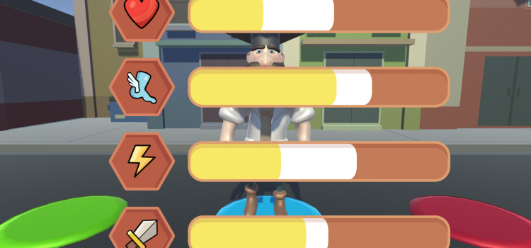
The Scouting Game Camp application is a short interactive level select screen. It was part of a themed activity week for children.
Scouting Game Camp


The Scouting Game Camp application is a short interactive level select screen. It was part of a themed activity week for children.

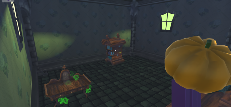
Haunted House is a bad 3D puzzle platformer. It has an interesting project and design process.
Heavy focus on why the things that are designed are the way they are, looking for the arguments to support a design
Learn to work with and from another dedicated designer in the team
Try to establish what is wrong with the team, how I can function within the team and how we are going to get a sufficient end result with that team, and how to prevent these situations in the future
extensive use of design models such as the Quality, Frequency, Clarity model for mechanics
major improvement in supporting designs with reasons why you would make a certain decision (or not)
fascinating to see how different people with a design background approach design when compared to people without this background
learned the importance of establishing everyone’s intentions early on
gained some experience working with audio
This is definitely the most interesting process I’ve experienced so far. It hasn’t necessarily resulted in the most interesting product, however.
In this project we worked together with students from the Utrecht University. In an early phase of the project, we struggled to form our ideas into coherent concepts. Everyone seemingly wanted to do something else. When we did agree on something, we ran into the same problem as soon as we started specifying details. Looking backwards, I’d say the main problem here was a discrepancy in design knowledge. I was grounded in more than a year of design ‘thinking’, and did not realise others might not have that same knowledge and thus would look on design in a very, very different way.
Anyway. In the project it gradually became clear every decision could be reverted if it did not fit someone’s vision. This forced me to look for the reasons why a certain decision was important, so I could counter attempts coming from personal likings or dislikings of certain decisions. I started looking for arguments and relationships that would support a design choice. Additionally, I reconstructed our decisions made so far to be able to show and tell why exactly we did something, and why going in another direction now was a good or bad idea when taking the previous decisions into consideration.
So we worked on an elaborate design, looking for relationships, tuning our ideas to fit an experience. This was a great experience as a designer. Unfortunately, there was a) too little time to fully implement the design and b) we still had a dysfunctional team, with the one building our game unwilling to make changes, presumably afraid we would lose what we already had. Still, it was a great learning experience. Looking back I would have forced a conflict early in the project, to make clear what intentions everyone has and to look for opportunities to continue the project in a different way.
In the final two weeks I mainly focused on adding audio for the game, to create a richer experience.
This way of supporting your design for arguments and relationships is something I apply in other projects now as well. A possible negative side-effect of this approach is that it can seem like everything is set in stone to other team members, because you can answer almost every why-question related to design.
Niels de Jong – designer, audio
Kevin van As – designer, bits & pieces
Mike Ottink – Lead Artist, designer
Dwight Peters (Utrecht University, Game Technology) – Programmer
Merle Delen (Utrecht University, Game Technology) – Project Lead, artist
11 weeks
Originally published on 11-12-2015
20 minutes

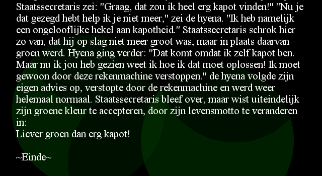
The verhalenmachine is a story generating application. Sometimes it makes sense.
The machine generates stories but they are destined to fade away, giving each story only a small chance to captivate its readers.
1 minute / story
infinite stories
This little project was created as an art piece for a school assignment. It was displayed on a digital schoolboard.
It was originally published on the web on 26-2-2013.
I designed and programmed everything in the application.
Some of the words have been provided by relatives.